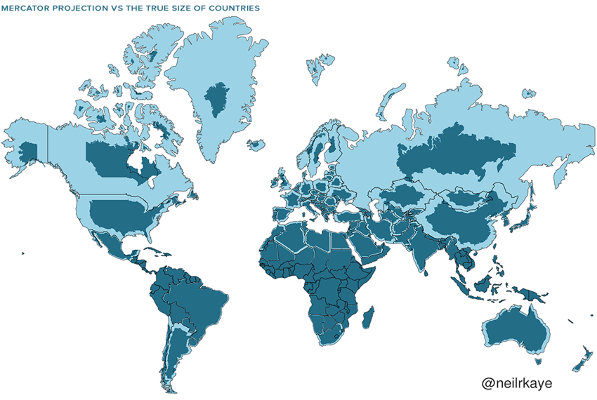
Our customary map of the world, the Mercator projection, is wildly inaccurate. Africa appears to be the same size as Greenland, when in fact it is 14 times larger. Antarctica seems to be the biggest continent, but it’s actually the third smallest and dwarfed by both the Americas. The map was first used by explorers because it preserves angles and shapes (for navigation), but as a result it massively distorts the size of land masses.


